COPA REBRAND
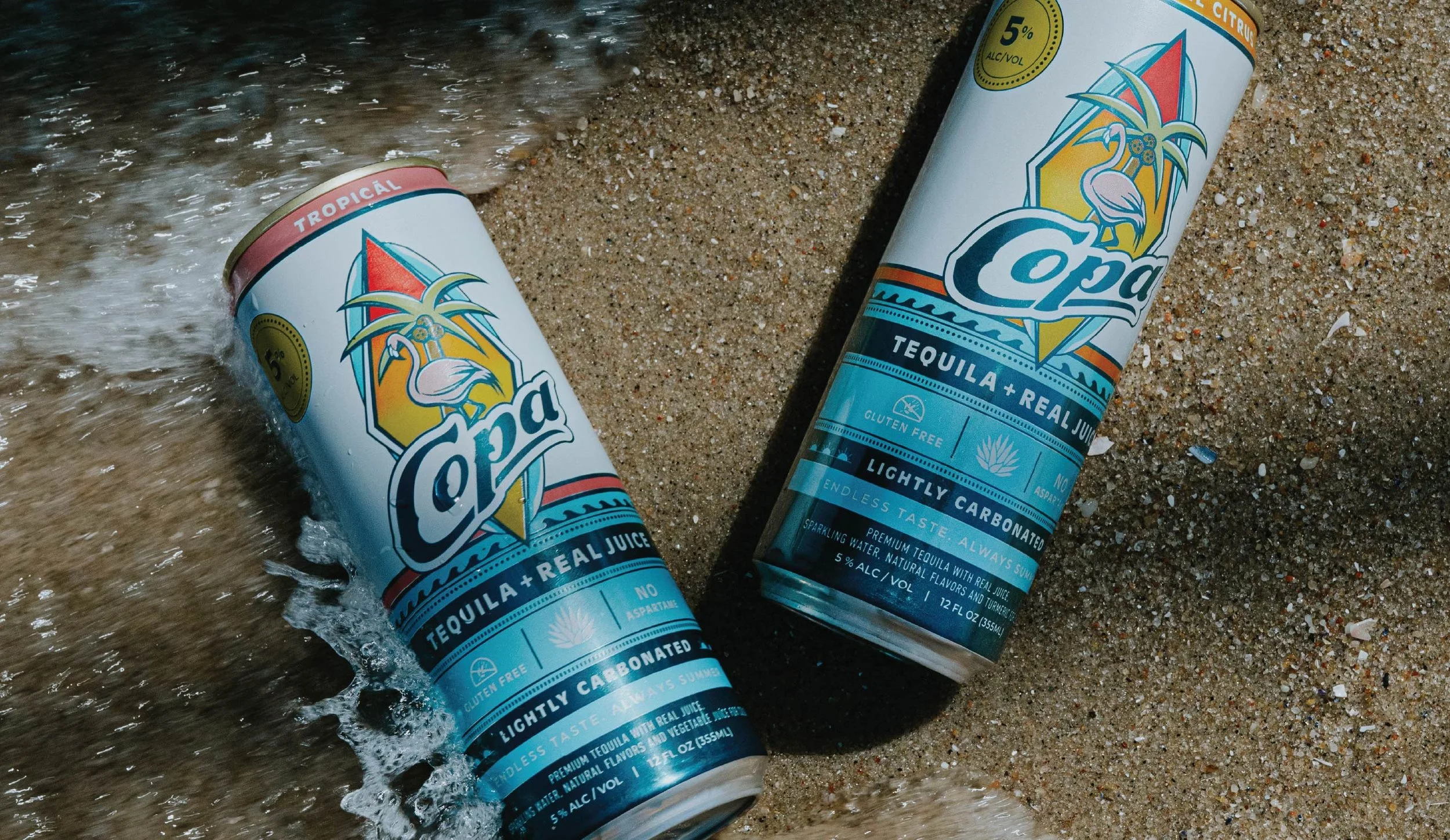
Copa is a canned tequila cocktail company operating out of New Jersey. They were looking to improve upon a few brand elements including the logo, logo treatment, and packaging. They really liked the overall feel of their existing branding, but recognized where it could be improved upon. Copa had successfully existed in the market for about 2 years with the original branding, but they were ready to take things to the next level.
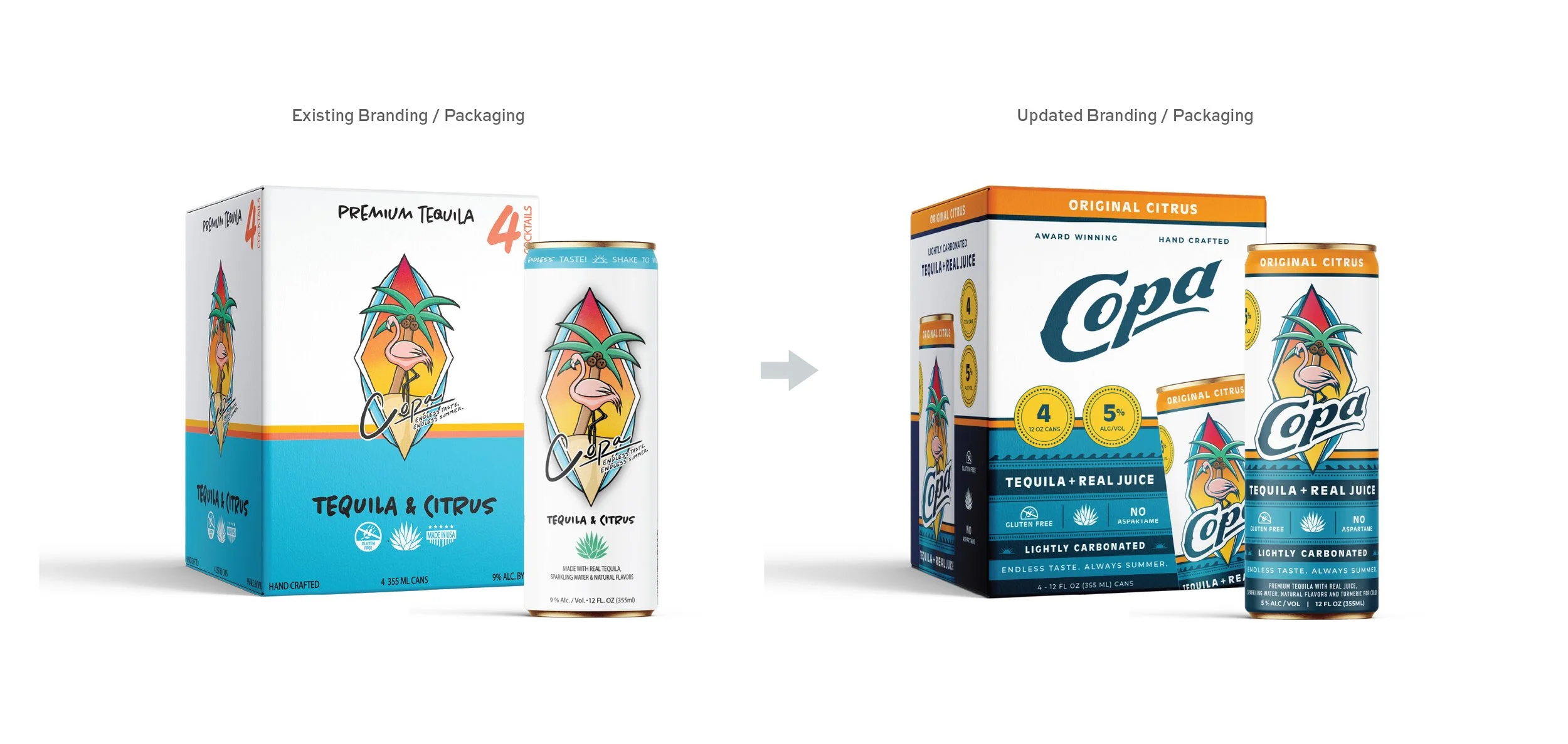
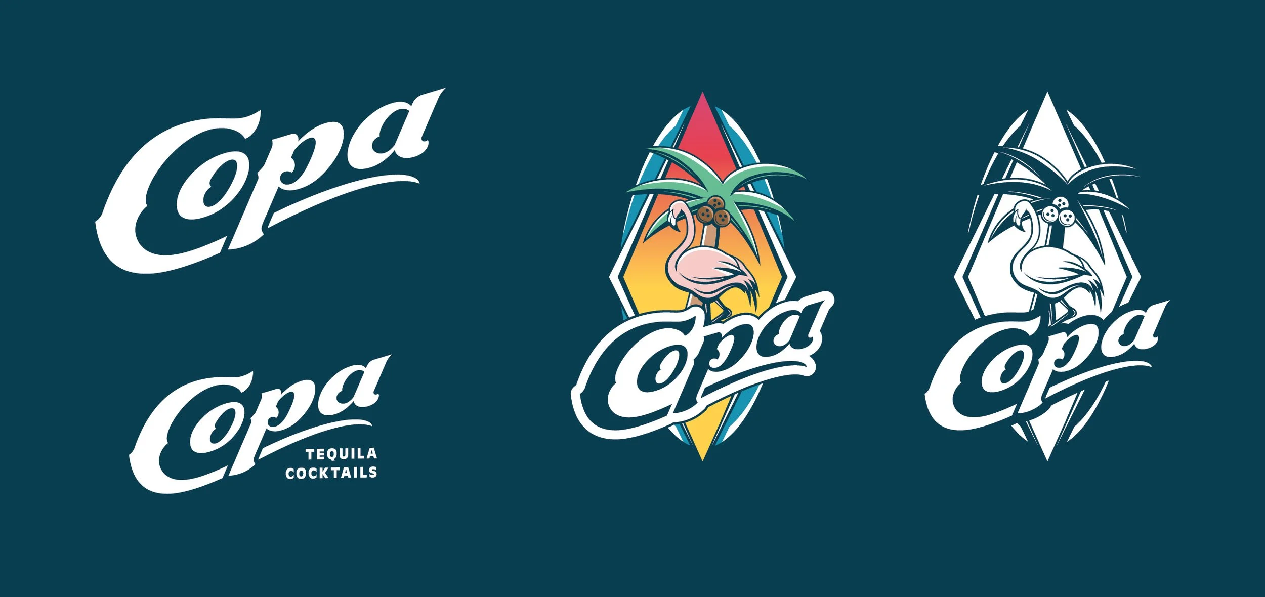
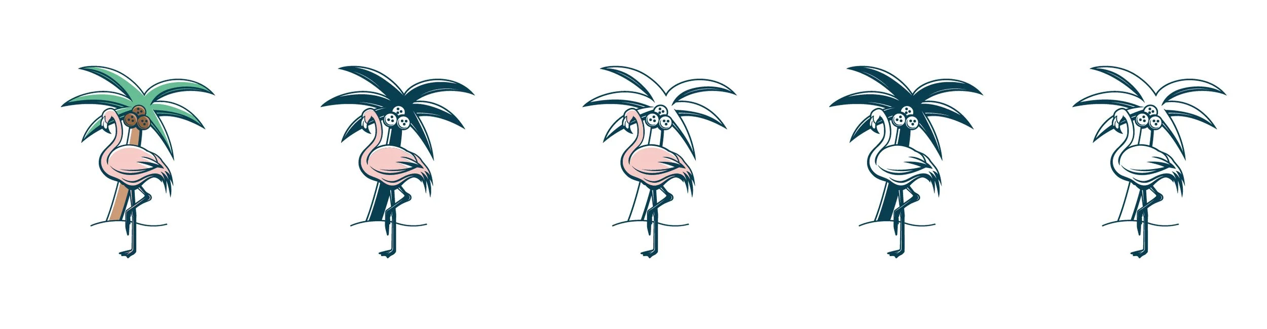
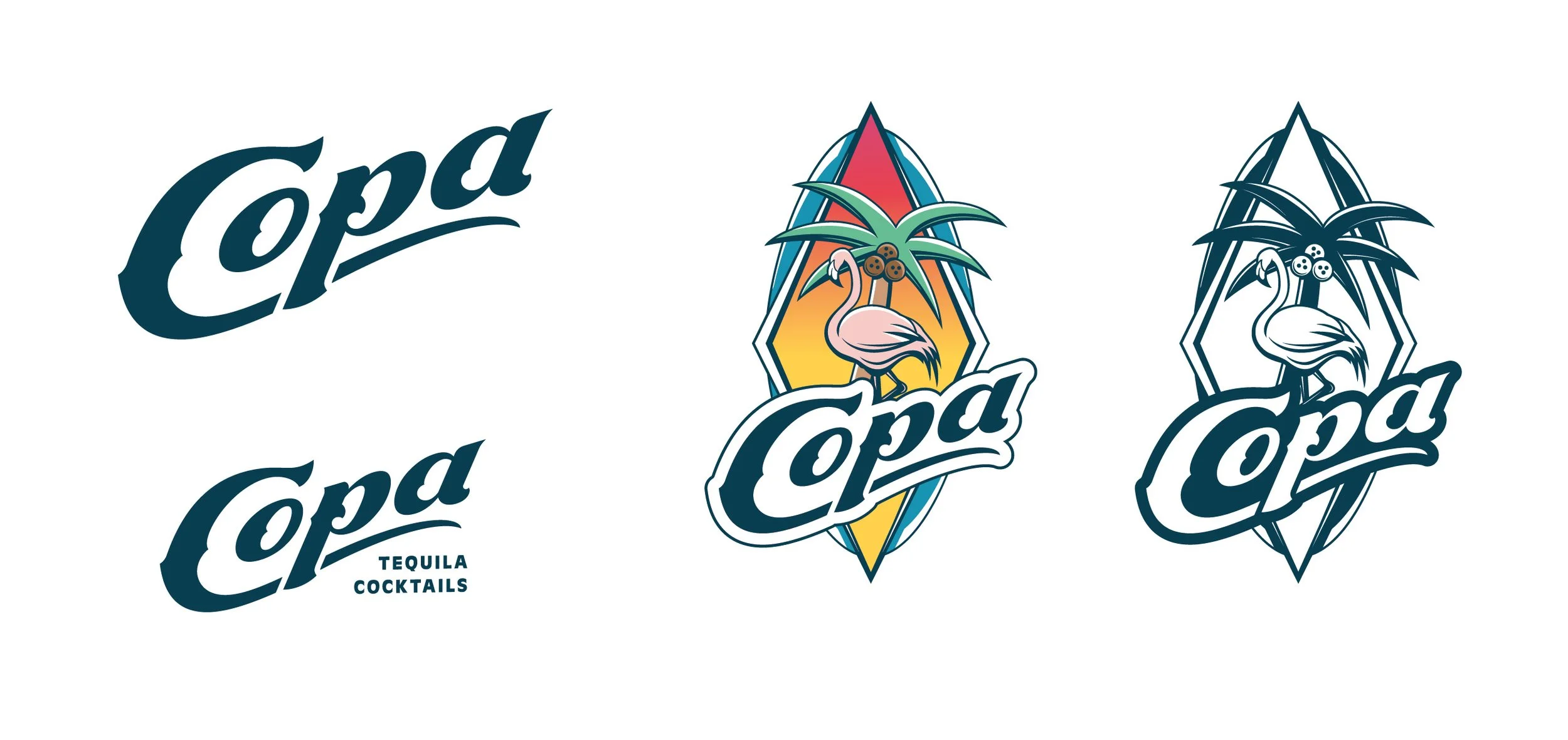
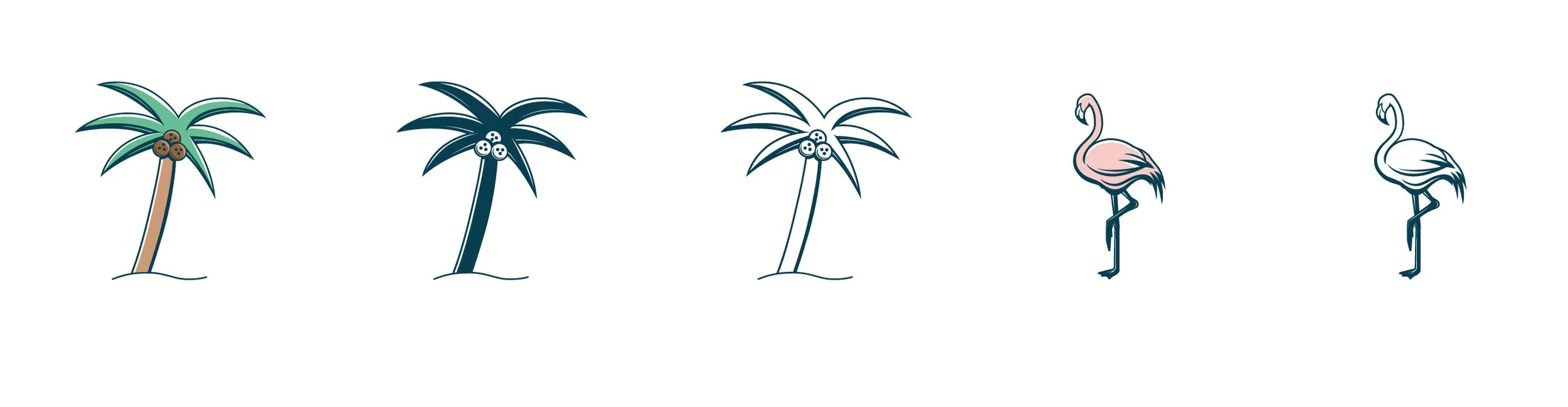
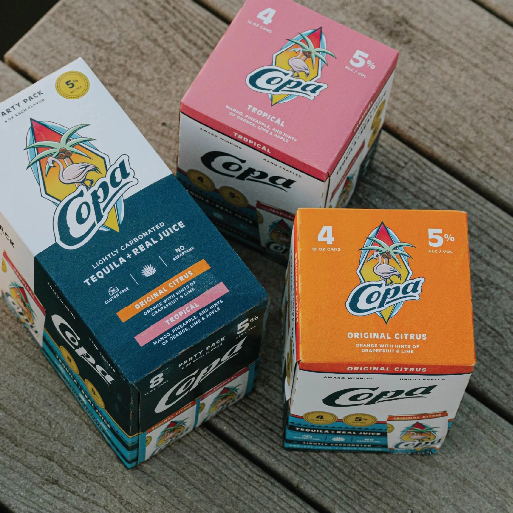
The existing logo was problematic for a couple of reasons; 1.) The word mark got lost in the graphic, and the tagline was far too small in most applications. 2.) The graphic also relied on too many colors in order to be successful. We recreated the logo to work with far less colors and even worked in one color applications. The word mark itself also needed some love. Since this mark is applied over a somewhat busy graphic, it was important to create something a little heavier and recognizable.
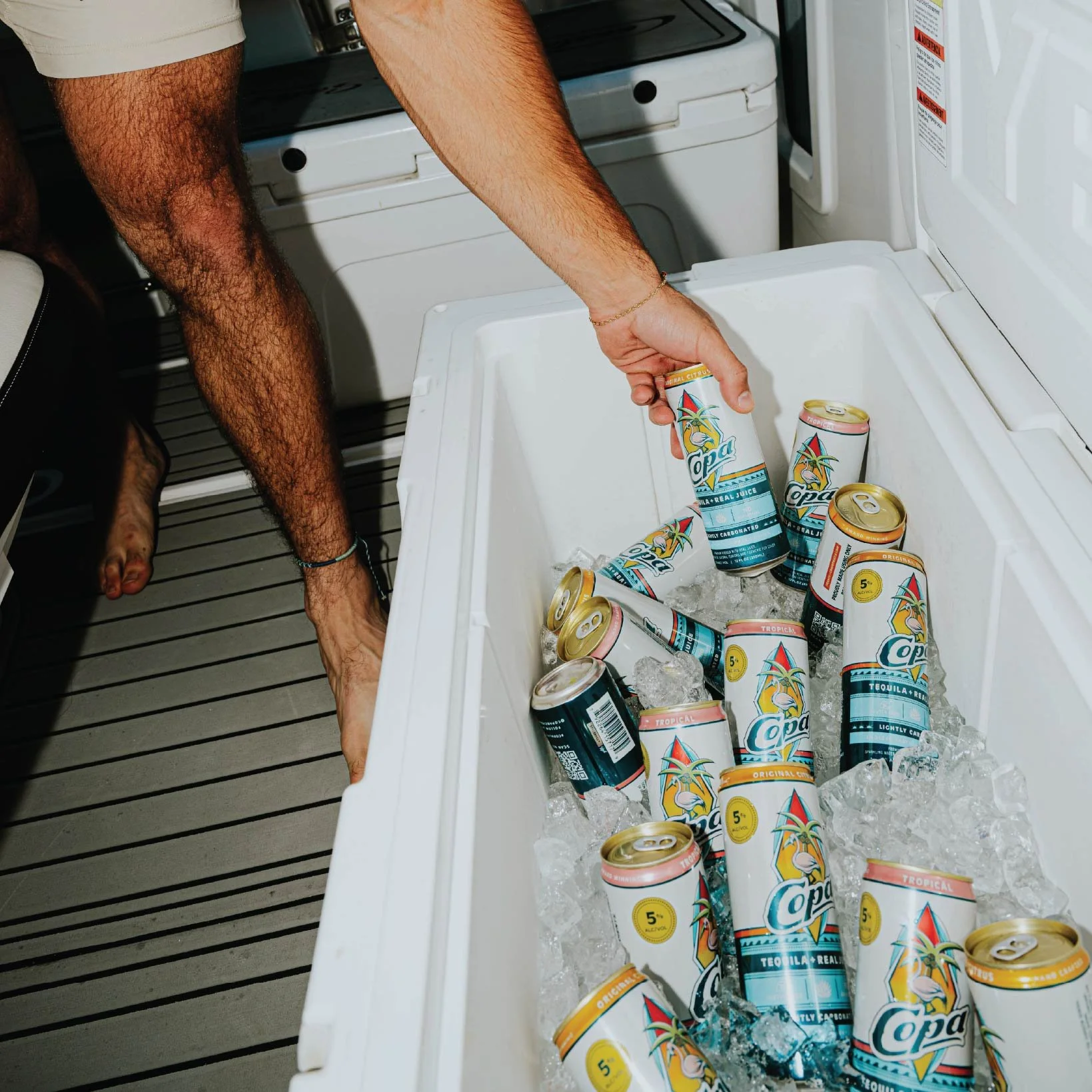
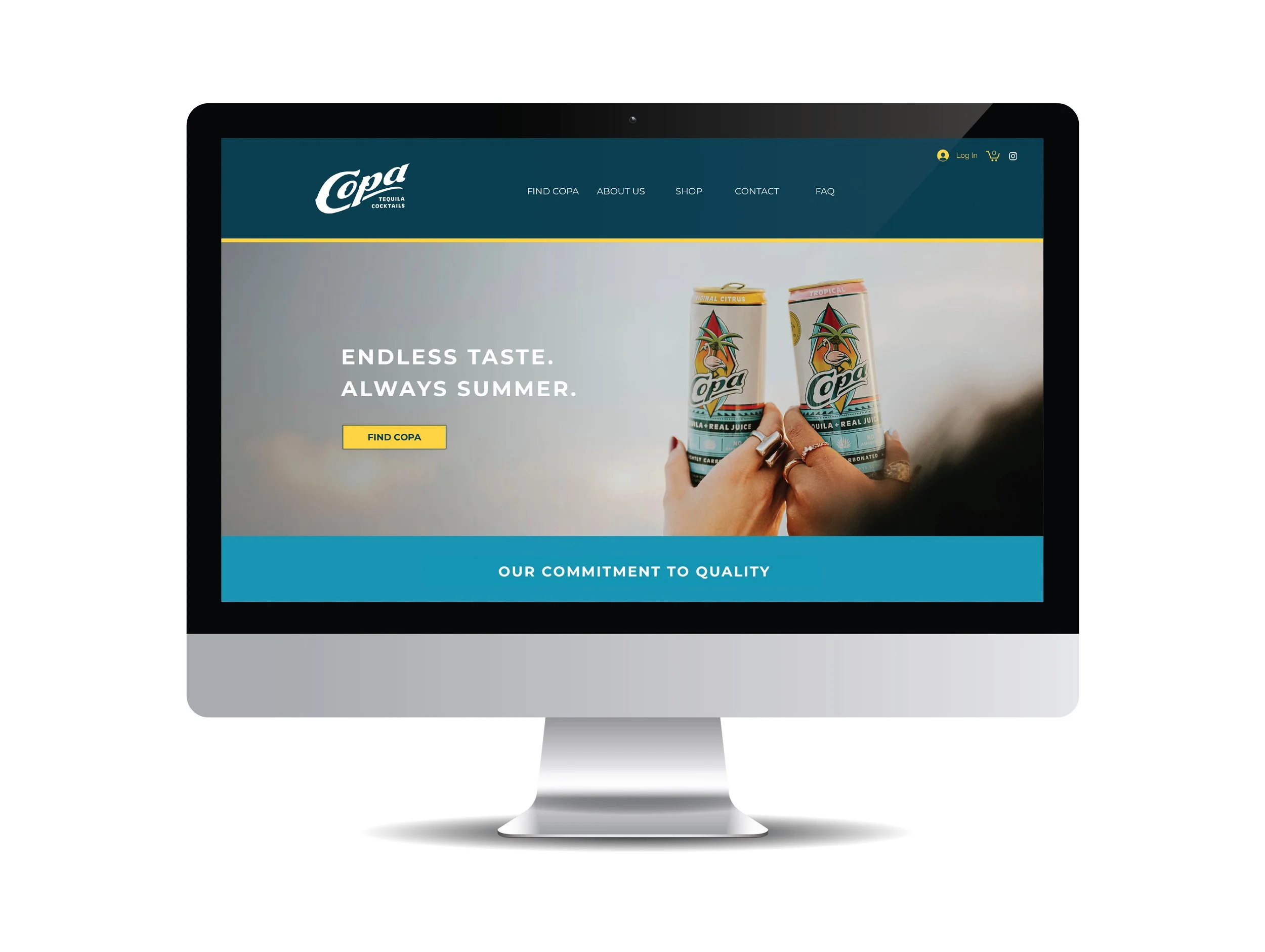
The final piece of this puzzle was getting the website updated to reflect the brand changes. We also created a line of Merch. We got to have a bit of fun here attempting to create something that felt more designed, and less like a promotional piece.


